Understanding the Math behind Recent Inflation Trends
Following the release of a recent monthly Consumer Price Index (CPI) report, I noticed some conflicting headlines among news stories. Here are just a few:
- Inflation sped up
- Inflation nudged up
- Inflation was up slightly
- Biggest jump in inflation in over a year
- Good news on inflation despite jump in gas prices
- Inflation ticked up for 2nd consecutive month
- High gas prices push up inflation, but prices overall are slowly moving in the right direction
- Gasoline lights up US consumer inflation; underlying trend steadily improving
- The CPI Was Hot
So, you might wonder, which is correct? Was the CPI hot, did it nudge up, or is it steadily improving? The answer lies in the way you look at the numbers. Let’s have some fun with math.
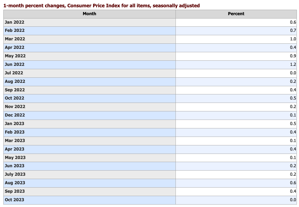
We’ll start by looking at the 1-month change in the CPI for all items, known as the “headline” CPI. As seen in the following chart, inflation rose 0.6 percent in August and 0.4 percent in September. So, prices were up in September, but up less than in the prior month. Was this good news or bad news? Let’s dig deeper.
Spikes in specific categories, rather than broader price movements, can have a large effect on monthly changes, so it’s important to look at what drove the overall change. In this case, the 0.6-percent increase in August was largely driven by a big increase in gasoline prices, which are often volatile. Gasoline prices rose more than 10 percent in August but only about 2 percent in September.
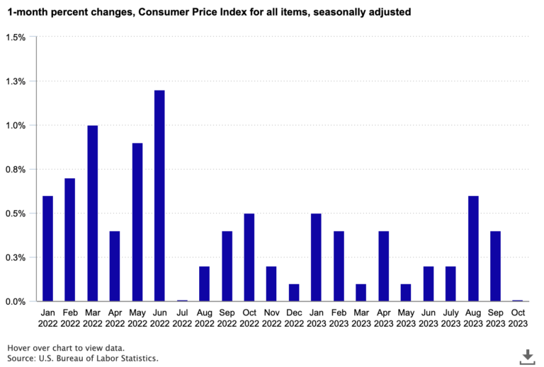
Note that when we focus on monthly changes, we generally use seasonally adjusted data. Some price movement occurs simply due to the time of year. For example, prices tend to fall (or at least increase less) in November and December because of holiday sales and other factors. Using seasonally adjusted data allows us to see price change that isn’t just normal seasonal variation.
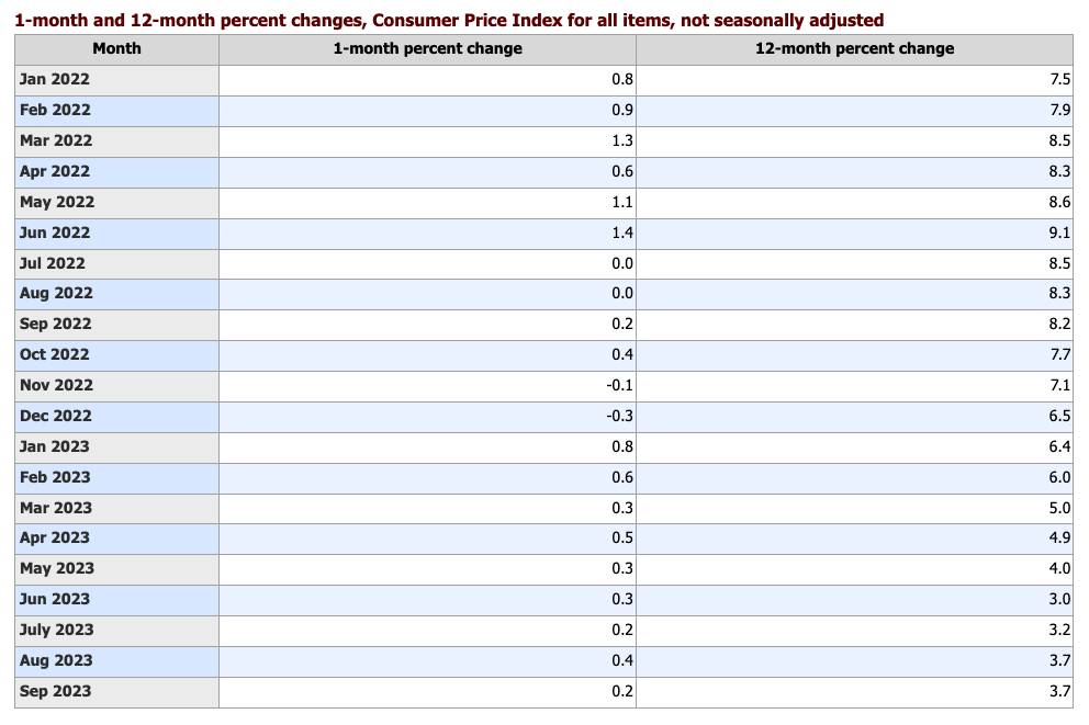
A common barometer of inflation is to look at the yearly change—how much higher are prices today than they were a year ago. This often gets a lot of attention, as it did in the summer of 2022, when the annual change reached 9 percent—the highest in 40 years. Similarly, the annual change got a lot of attention earlier in 2023 when it dropped rapidly, as the following chart shows.
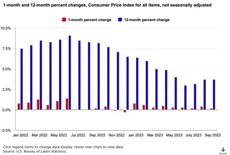
Consider, for example, the annual changes for February 2023 and March 2023. The 12-month change from February 2022 to February 2023 was 6.0 percent, but it fell to 5.0 percent for the period from March 2022 to March 2023. However, the monthly change in March 2023 was positive, a 0.3-percent increase. The decrease from 6.0 percent to 5.0 percent was mainly because a large 1-month increase from February to March 2022 of 1.3 percent is now outside the 12-month window. The base of the 12-month period is now the higher March 2022 index, which gives us a smaller 12-month change.
The movement in the 12-month change from one month to the next depends not only on price change this month but on the price change for the same month a year ago. Whether the 12-month change for September 2023 is higher than the one for August 2023 depends on whether the monthly change from August to September 2023 was larger than the change from August to September 2022. In this case, they were about the same; the September 2022 and September 2023 increases were both 0.2 percent (not seasonally adjusted). So, the 12-month change remained stable at 3.7 percent. It is possible for the 12-month change to rise even if prices fall over the month (and vice versa)!
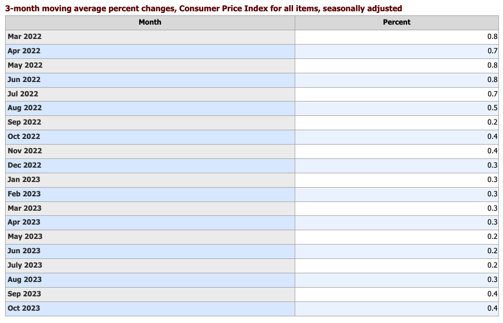
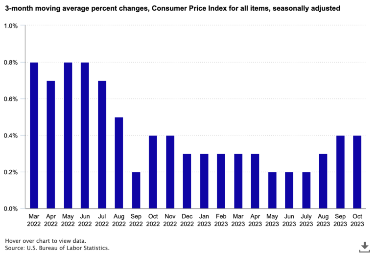
So, if the 1-month change can be influenced by an unusual spike in a particular item, and the 12-month change is influenced by the base effect, are there other ways to assess the recent trends in inflation? One approach is a 3-month moving average, which focuses on the most recent data but avoids short-term spikes. In the chart below, we see less volatility in recent months than we see in the 1-month changes. The inflation rate was largely steady for several months in 2023, with a slight increase in the most recent months.
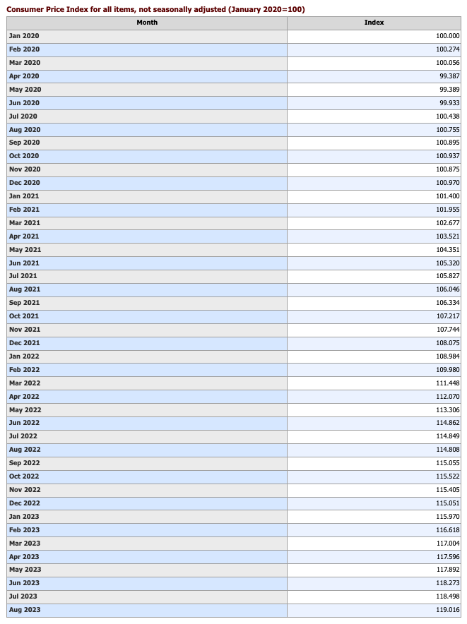
Another approach is to focus on the index numbers, rather than the percent change. In simple terms, the monthly calculation of the CPI yields an estimate of the price level relative to a base period. For most CPI indexes, the base period is 1982–84. The index number, compared with the prior month’s number, results in the 1-month percent change that you see in news headlines. Similarly, comparing the index number from one year to the next provides the 12-month percent change. But looking just at the index numbers provides a different perspective.
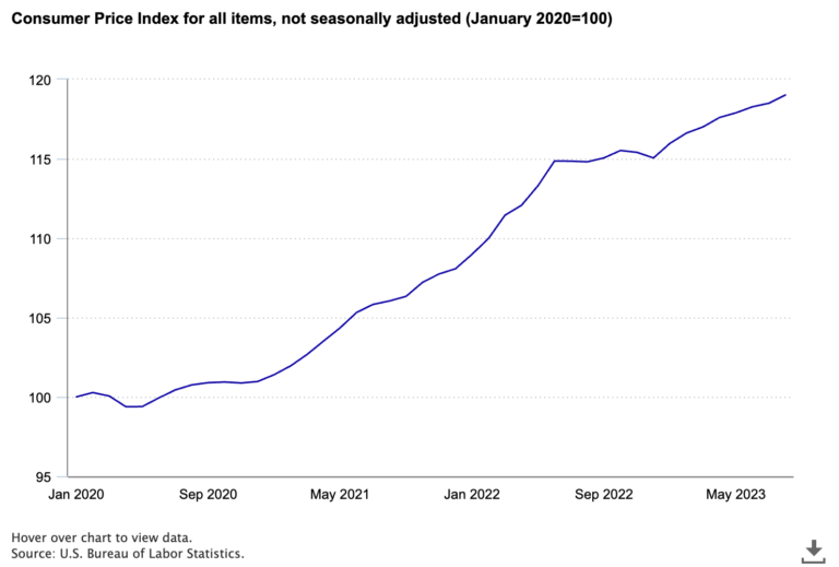
One thing you notice from the chart of index numbers is that the line continues to go up. Prices tend to continue to rise, sometimes slowly, sometimes quickly. For those of you who still remember high school geometry, you will notice that the slope of the line changes, consistent with the higher and lower rates of inflation.
Maybe you want to consider inflation over a longer period, like since the same month 5 years ago or since the Mets last won the World Series. The index numbers can help with that as well. In August 2018, the index for the CPI stood at 252.146 as compared with 307.026 in August 2023. Some quick math reveals a change of about 22 percent over 5 years. Going waaaay back to when the Mets took the series in 1986 (I’ll use August just to make the math easier), the index number was 109.7, and the change over those 37 years was 179.9 percent. We even have an inflation calculator so you can pick your own favorite date (like your birth month or some other special occasion) and find how much prices have changed since then.
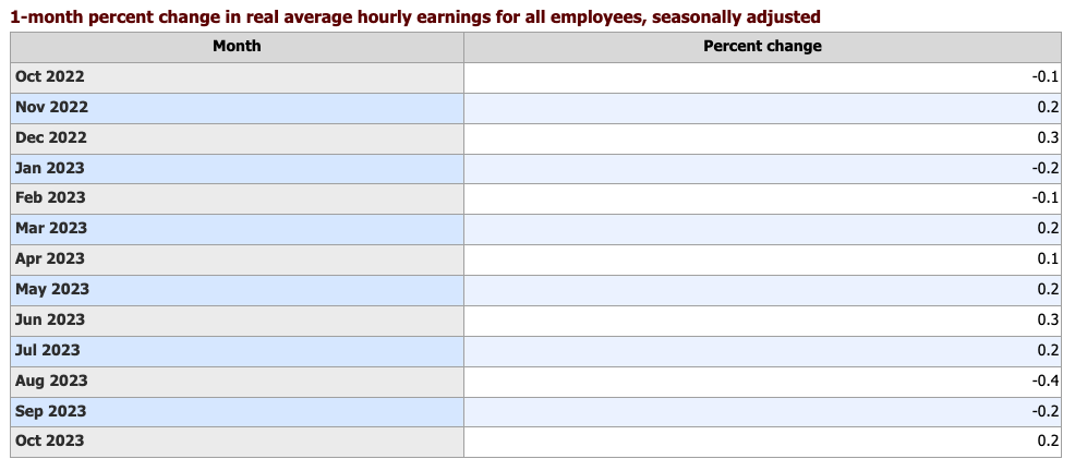
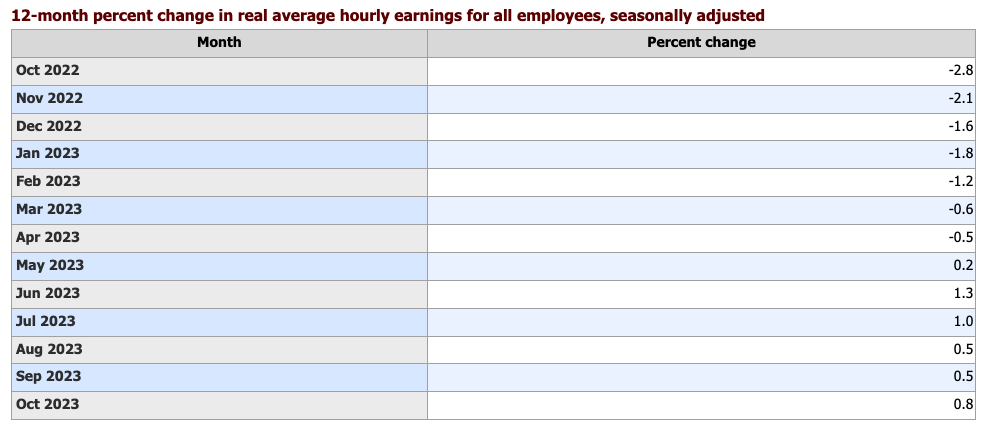
But, perhaps the trend in inflation is not the focus you need. Another way to look at price change is to consider the impact. For instance, you can compare price increases to increases in workers’ earnings to find out if earnings are keeping up with inflation. The BLS real earnings data do just that by comparing the average hourly earnings (from the Current Employment Statistics program) to the CPI. When earnings rise faster than inflation, real earnings are positive. In contrast, if inflation exceeds earnings growth, real earnings are negative.
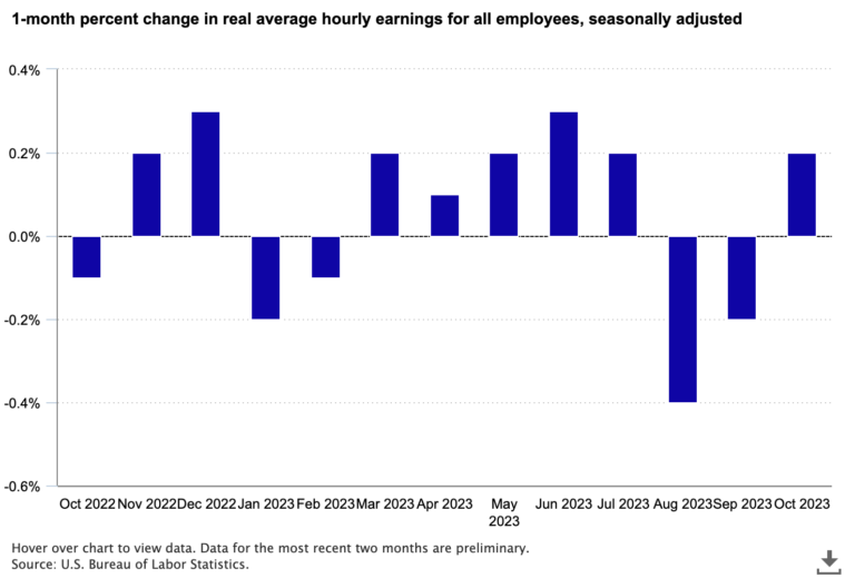
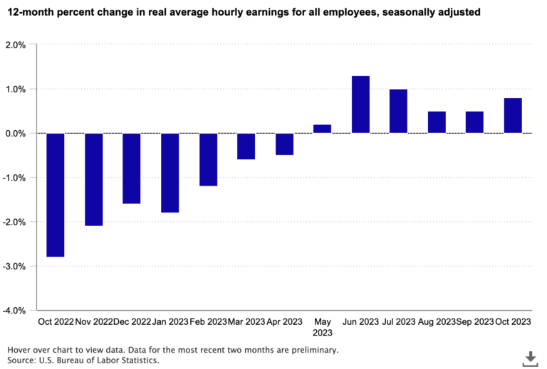
As with price change, we can look at both monthly and yearly changes in real earnings. Monthly increases in real earnings from March through July 2023—meaning earnings were rising faster than prices—pushed the 12-month change in real earnings from negative to positive starting in May. Recent monthly declines in real earnings resulted in smaller 12-month increases.
As you can see, when it comes to assessing what’s going on with inflation, you have lots of choices. At BLS, our goal is to provide all the information, at high quality, so you can use that information to make decisions.
A special thanks to Steve Reed of BLS for his contributions to this blog post.
Data for all charts above from the following tables:
